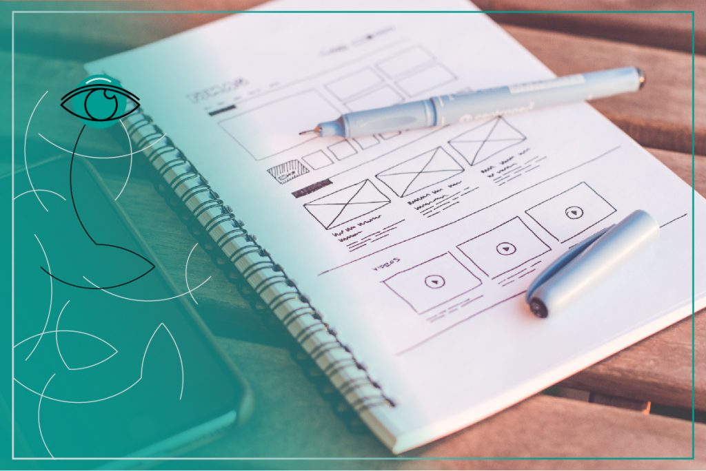
Graphic design – a sketching block and some crayons will not do

Recently, design has become a very fashionable concept. It is a keyword which refers to almost everything, from architecture to business cards. What should you focus on when working on the visual identity of your company? What mistakes should you avoid? And most importantly, how should you match particular design elements?
Golden ratio
Mathematics often considered to be the core foundation that the other sciences are built on – finds its place in all spheres of life. The same can be said here. Graphic designs should maintain an appropriate balance so as to appeal to the viewer. While designing a person’s silhouette, you must consider appropriate sizes and symmetry, otherwise, the viewer would feel that there is something wrong with your design.
Rule of tripartition
The principle refers to the composition of an image. Every image has three points that are the most eye-catching. Your project should be divided into three parts, horizontally as well as vertically. It will create a grid where the most prominent points are to be found at the intersections.
Less is more
The more effort the receiver has to make, the less likely he is to make a purchase. The more complicated a graphic is, the smaller a chance that the receiver will analyse it. Simplicity is the key. Simple design and form are more effective than rich ornaments and five different fonts within one project.
Closeness
If individual elements are close to each other, they will be noticed quickly. Large distances create chaos. Moreover, if the elements are side by side, the recipient will know that it is intentional and that those elements are in some way related.

Associations
People look for things in their surroundings that are close and familiar to them. It is also the case with graphics. The recipient will look for associations and the more he finds them, the better. It is much easier to assimilate new information when it is reminiscent of a previous experience.
Consistency
It is crucial to be consistent when you are preparing a bigger project that includes a couple of loosely connected elements, such as business cards, neck straps or letterheads. Each one of them should be kept in one style and create a unified whole. Use the same colours, lines and fonts because these things grab the most attention.
Measures and quality
Think whether a project is meant to be placed on the Internet or to be printed. If print, then in which format should the graphic design be? Reducing size is not an issue. It gets more difficult when some elements are too small and scaling them up will lead to a loss of quality. Therefore, you need to concentrate on this from the very beginning of the project.
Concept and accurate planning are important in graphic design. Without a preliminary draft, it is hard to design consistent graphics. And without consistent visual identification, it is difficult to gain in popularity in the industry and among your customers.
We specialise in branding, web and graphic design. Should you need any help, please get in touch.


Maria Loades
Connect with Maria on LinkedIn
Interested in Guest Blogging?
Visit our Guest Blogging Guidelines page.
Latest posts by Maria Loades (see all)
- Content strategy and Storytelling for B2B Campaigns - February 4, 2019
- CIPR PRide Nominations: TANK - October 19, 2018
- Interview with Susanne Kelz-Schmid, Marketing Specialist, Leykam Let's Print Holding - November 11, 2017